
By Laura E.P. Rocchio
Glaciologist and prolific AGU blogger, Mauri Pelto, regularly publishes posts about changing glaciers around the globe on his From a Glacier’s Perspective blog.
In many cases, Landsat data informs his posts.
This month, Pelto posted five Landsat-based blog posts:
- West Hongu Glacier Retreat-Ablation Extending into January, Nepal; September 6, 2016
- Herbert Glacier Retreat, Alaska 1984-2016; September 14, 2016
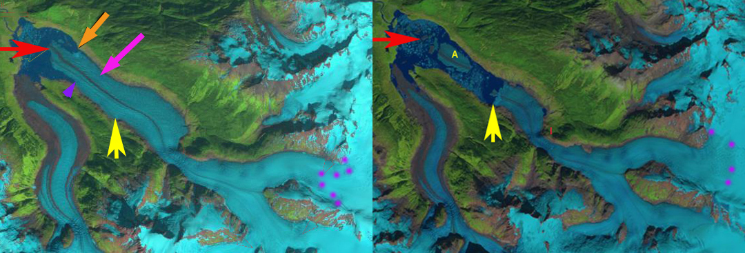
- South Sawyer Glacier Retreat and Separation, Alaska; September 20, 2016
- Porcupine Glacier, BC 1.2km2 Calving Event Marks Rapid Retreat; September 22, 2016
- Storglombreen Glacier Loss, Norway; September 28, 2016
In an interesting aside, Pelto’s daugher, Jill Pelto, an artist and environmental scientist, has been combining her art and science backgrounds to create data-based works of art, like the artwork to the right.
Further Reading
+ From a Glacier’s Perspective
+ These Paintings Turn Climate Data Into Art, Climate Central
+ These Watercolor Paintings Actually Include Climate Change Data, Smithsonian
+ Painter captures the data of climate change in 7 stunning watercolors, PBS NewsHour