Measuring glacier movement—famed for its glacial pace—is often done with GPS ground measurements or image-based feature tracking (e.g. the movement of surface debris). While these measurements are reliable, visually demonstrating this gradual movement using static images can be challenging given the brain’s limited ability to discern change between two static images.
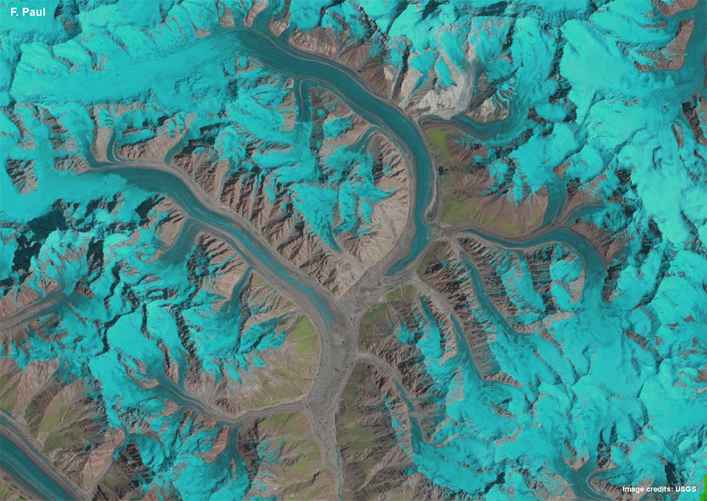
Paul’s paper, published on Nov. 26 in The Cryosphere, focuses on a set of four regions with numerous glaciers in the central Karakoram mountain range, a steep rouged landscape of high terrain (> 7000 m or ~23,000 feet in some places) and home to behemoths such as K2.
In this region, unlike most other global locations, several glaciers are rapidly advancing. But these are surging glaciers whose normal flow rate is interspersed with periods when velocities increase by as much as three orders of magnitude. The accreting behavior of the region’s glaciers has been labeled the “Karakoram Anomaly.”
Paul’s animations allow Karakoram glacier flow patterns to come alive for viewers. Both the regular flow of non-surging glaciers and the peculiar flow patterns of surging glaciers can be witnessed. In this complex interaction, supra-glacial lakes appear and disappear, terminuses advance, rivers of ice coalesce then separate post-surge, and all the while glacial debris seems to dance and swirl.
The animations were created for everyone interested in seeing how dynamic and complex the interactions between glaciers can be, especially in the understudied Karakoram region, Paul explained.
This non-quantitative approach to examining glacier flow dynamics has nonetheless provided additional insights to how the tributary glacier streams interact with major glaciers. The animations enabled the rapid advance of four small, likely also surge-type glaciers south of the larger Baltoro glacier to be documented for the first time.
Most interestingly, Paul discovered that the surging glaciers of the investigated region in the central Karakoram are unlike other known surging glaciers. The Karakoram “surgers” exhibit much longer surge phases (up to several decades) and advance much slower (about 100 m year). They are also typically small and debris-free making a separation from ‘normal’ but also advancing glaciers difficult.
Several of the surging glaciers of Karakoram do not leave the morphological evidence that surging glaciers in other parts of the world do—making time-series image analysis one of the only ways to identify them.
To create his time-series animations, Paul combed through 25 years worth of free 30-meter resolution Landsat data. He carefully selected images where snow cover did not obscure glacier boundaries, typically acquired at the end of summer.
“This research was only possible thanks to the free and open Landsat data policy,” told Paul.
“Landsat is key to a wide range of applications that support global glacier monitoring and elucidate the impacts of global climate change,” explained Paul. Landsat data helps glaciologists map glacier extents, trace area and length of glacier changes through time, derive surface velocity, map snowlines, and calculate albedo for mass and energy balance calculations.
Paul’s animation design process was to download USGS full-resolution “quick look” Landsat JPEGs, stack the Landsat images together in a GIS program, convert the individual images to GIF file format, and then sequence them to create animated GIFs.
The expert orthorectification of Landsat images (i.e., geolocation that accounts for any terrain-caused image distortions) allowed Paul to easily stack the images on top of each other with confidence that they were properly aligned geographically.
For the animated GIFs, each Landsat image is shown for just 1/10 of a second. This fast frame sequence—speeding up glacier movement by as much as 800 million times—gives the impression of continuous flow.
“A key idea is that these animations are easy to create for everybody using the geocoded Landsat quick look images,” Paul shared. “It might attract the younger generation interested in science, as they can do this at home.”
And for current glaciologists?
“Having all of this Landsat data available more or less globally since 1984 will keep glaciologists busy for some more years, if not decades.”
Further Reading & Animations:
+ Revealing Glacier Flow with Animated Satellite Images, EGU
**See the MEDIA section at the bottom of this page for links to the the animations**
+ Timelapse from Space Reveals Glacier in Motion, ESA
Reference:
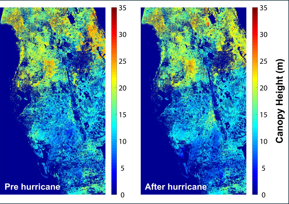
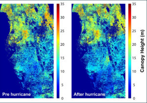
Mapping Forest Damage from Hurricane Milton on Florida’s West Coast
Rising sea levels and increased ocean temperatures are supercharging hurricanes. Using satellite data can help monitor vulnerable ecosystems.