By Laura E.P. Rocchio

If you have been to a U.S. National Park recently, chances are that Landsat imagery may have helped inform the park map that you grabbed for your hike.
We recently spoke with National Park Service cartographer Tom Patterson about his mapmaking process and how he uses Landsat in his work. Here is what he shared with us:
What types of maps do you typically design for the Park Service?
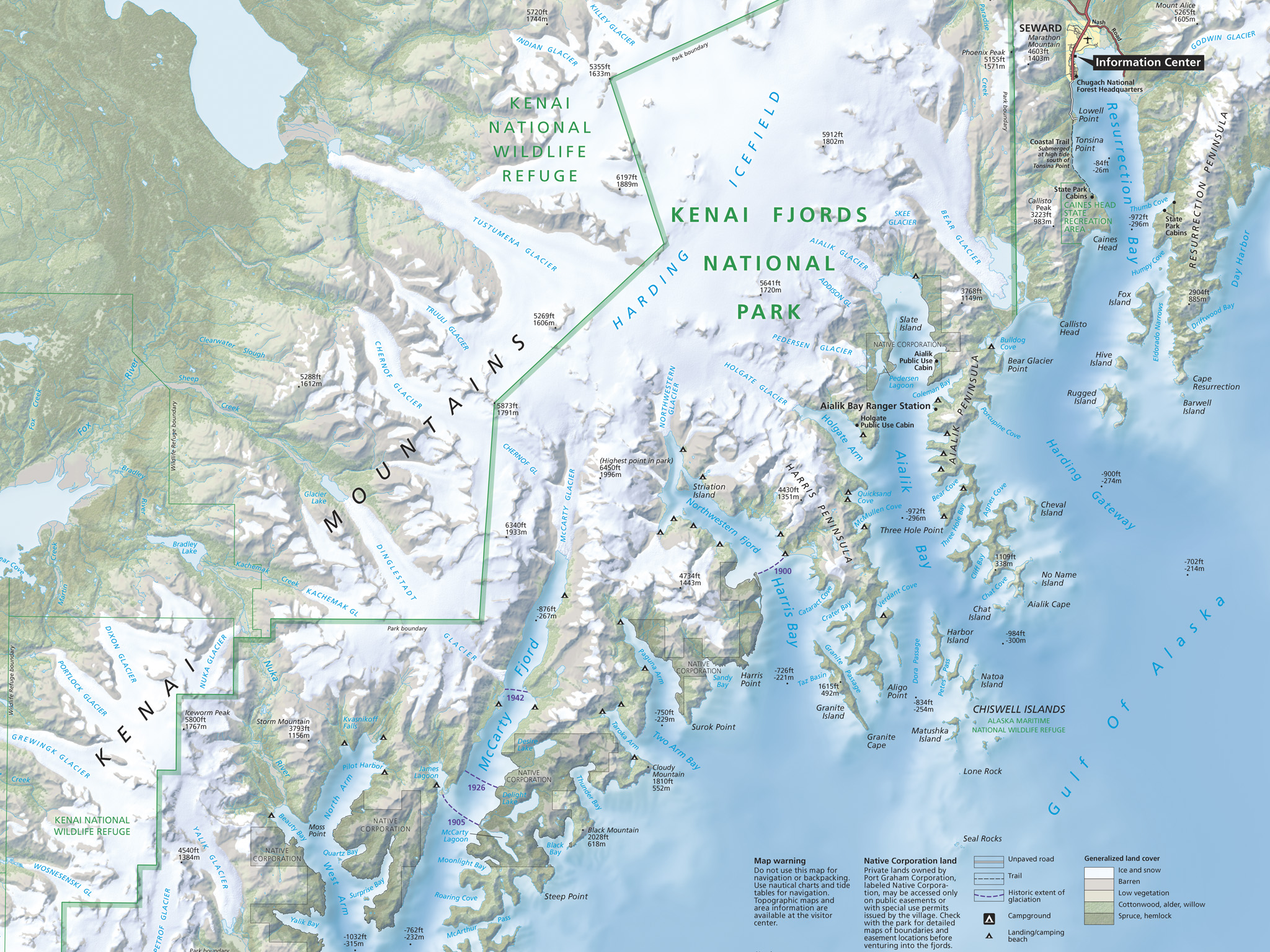
I create visitor maps for a variety of media, including publications, outdoor sign boards, visitor center exhibits, and movies. The primary purpose of most of NPS maps is park orientation and navigation. But our maps go deeper than that by also telling the interpretive stories of parks.
For instance, the map of Kenai Fjords, Alaska, depicts generalized land cover—glaciers, barren land, low vegetation, and forest. Bathymetric shading in the ocean reveal submerged glacial moraines. However, given the geographic diversity of the NPS—park sites range from north of the arctic circle to south of the equator and span 11 time zones—there is no typical NPS map. I am presently working on 43 maps.
How have Landsat data contributed to your workflow?
When making a new map, I first go on a scavenger hunt to collect geospatial data in the public domain. These data are the artistic elements that drive my map design.
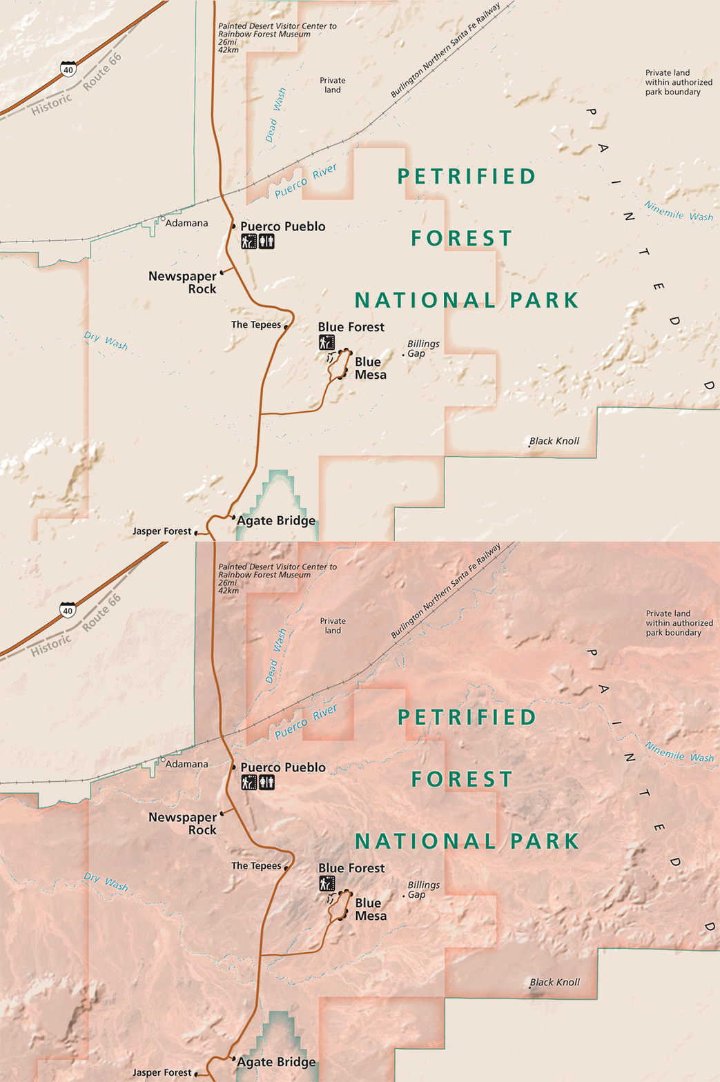
In the case of Landsat, I typically selectively extract textures from the images to give maps a more natural and organic appearance. For example, the map of Petrified Forest, Arizona, contains a hint of Landsat to depict the colorful rocks and arroyos of the Painted Desert.
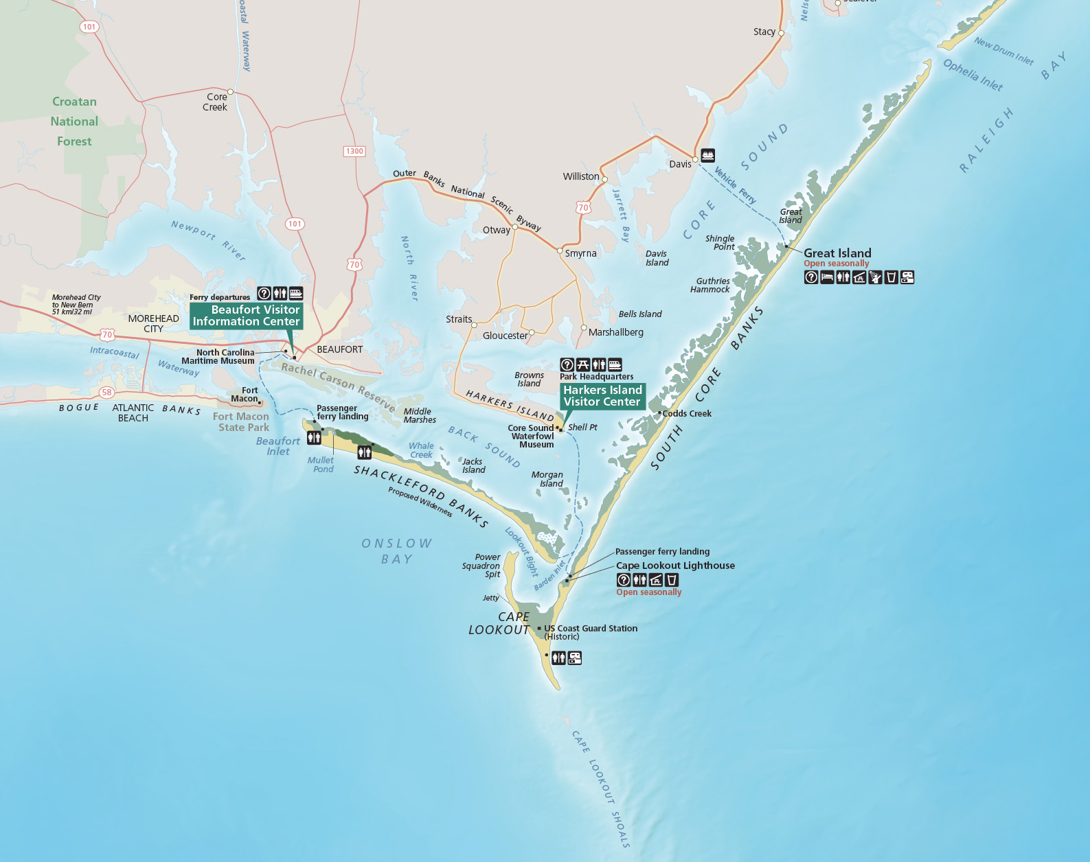
With new images taken every 16 days, Landsat is an ideal resource for updating maps in places where the landscape is in flux. Thanks to Landsat, the coastline for the map of Cape Lookout National Seashore, North Carolina, is more up-to-date than National Hydrographic Dataset. Glacier positions on the map of Wrangell-St. Elias National Park, Alaska, also received a major update based on the most recent Landsat images.
When and how were you first introduced to Landsat satellite imagery?
My awareness of Landsat goes way back to my undergraduate days in the 1970s. But because Landsat images were then very costly, my exposure to them was limited to images used for class projects.
For the next 40 years I used Landsat infrequently, because of the cost and not having image editing software.
That all changed in 2008 when USGS made Landsat data available online for free. Then in 2013 Landsat 8, with its even better imagery, launched.
Your design philosophy is guided by the idea of “cartographic realism.” Can you explain what that is and if Landsat helps you with it?
A challenge at the NPS is to design maps for 330 million annual visitors from around the world, many of whom are novice map readers.
So that a visitor can make a better connection between the map they are holding their hands and the park that are in, I try to design maps that mimic the colors and textures of nature. This often means abandoning past mapping conventions.
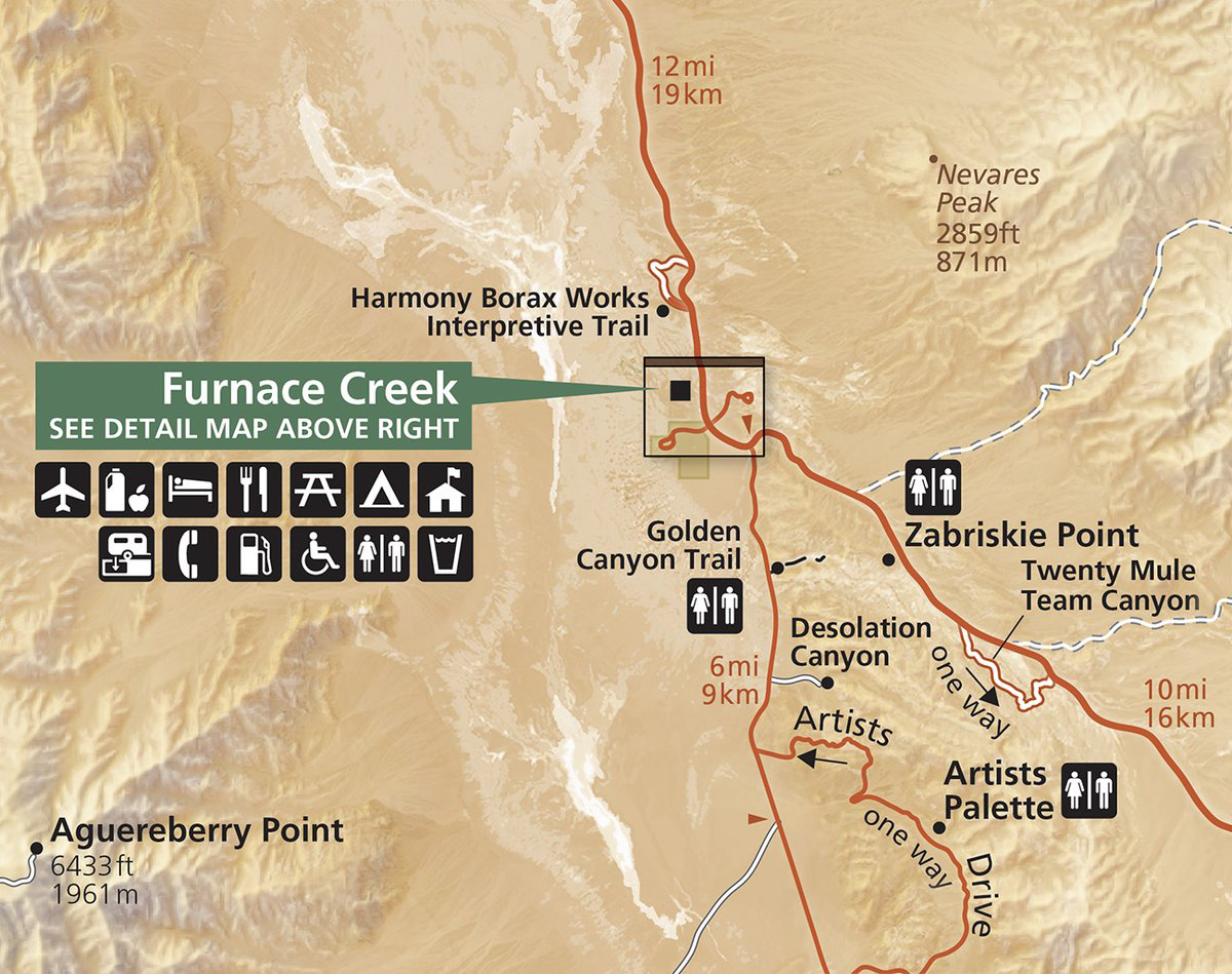
For example, all park maps made decades ago used a green tint for NPS land. While that color choice would work well for a map of Great Smoky Mountains, it is doesn’t make sense for hyper-arid Death Valley. The new map of that park features warm brown colors resembling what the visitor will see there.
What is your preferred way of finding and downloading Landsat data?
The USGS EarthExplorer website is my source for Landsat. The GUI is intuitive to use, it offers large preview images, and downloading is as easy as clicking a button.
In addition to downloading GeoTIFF data bands, I usually get the pre-composited LandsatLook images for a quick reference. For fun, I go the site every week or two to check out new images for favorite places around the world.
Of your maps that have incorporated Landsat data, what are some of your favorites?
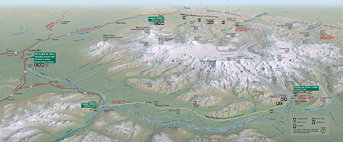
My favorite maps are always those that I am currently working on. I am now wrapping up a panorama of the Wrangell Mountains, Alaska, featuring a Landsat mosaic draped on a DEM.
The Landsat mosaic dates from early June with snow covered mountains rising above the green lowlands, a color combination that emphasizes the great elevation range. To brighten the lowland green, I blended 7-5-3 LandsatLook images with natural color 4-3-2 images.
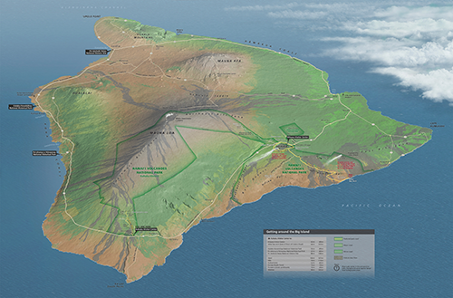
Hawaii Volcanoes National Park is another 3D map that I am working on. It uses a mosaic of the entire Big Island made up of 13 Landsat scenes. Given the tropical climate, finding cloud-free images to piece together was a challenge, particularly on the windward coast. The final Landsat that I draped on the DEM had additional modifications; it is less contrasting than the original and a vector mask emphasizes only historical lava flows since 1800.
Do shaded relief techniques and Landsat data work together for you when you are designing maps?
Yes and no. Relief inversion—mountains that look like valleys and vice versa—is a fundamental problem with Landsat images due to southeast illumination (Landsat images are taken in mid-morning) casting shadows on northwest slopes. Shaded relief maps largely avoid the relief inversion problem by using a northwest light source, which works better graphically. (Our minds expect upper left illumination and lower right shadows.)
When using Landsat to make a map, I try to minimize the embedded shadows in the image. Using images taken around summer solstice when the sun is highest is one way of doing this. Another technique is to use Landsat textures only in relatively flat areas where few shadows exist. I did this for the map of Petrified Forest National Park (mentioned previously).


