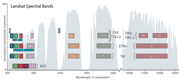
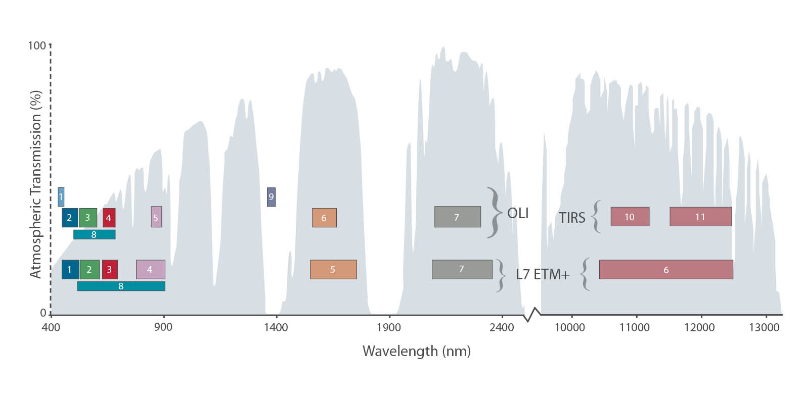
When TIRS was added, the graphic expanded to include the thermal infrared portion of the electromagnetic spectrum and the two new TIRS bands.
Since then, versions with all of the Landsat satellite bands have been created, versions with just Landsat 9’s bands, versions with the Sentinel-2 MSI bands; other teams have created versions with HyspIRI VSWIR bands; our USGS partners added MODIS and ASTER bands and small-sat and cube-sat bands to the graphic too.
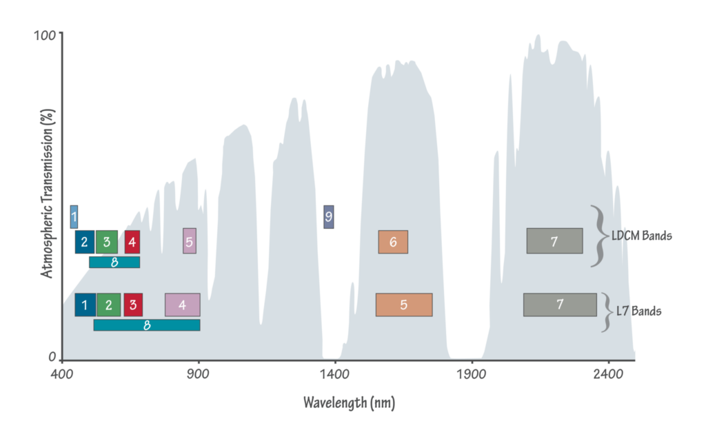
The original infographic—created as a joint effort of the Landsat outreach and calibration teams—debuted on a banner display for Landsat 8 (then called the Landsat Data Continuity Mission, or LDCM); it was shared for the first time at a conference during an LDCM talk at Pecora 17 in November 2008; and it was added to the Landsat Science website, where it and its expanded descendants have been downloaded repeatedly.
Versions of the graphic can now be found in countless papers, in conference talk slide decks, on Landsat scientific posters, on websites, in technical reports, and in books.
Adding atmospheric transmission curves to sensor spectral band graphics is a tradition that began when space-based remote sensing was in its infancy. Measuring specific spectral regions from space required that those energy wavelengths could get through Earth’s atmosphere and reach the satellite.
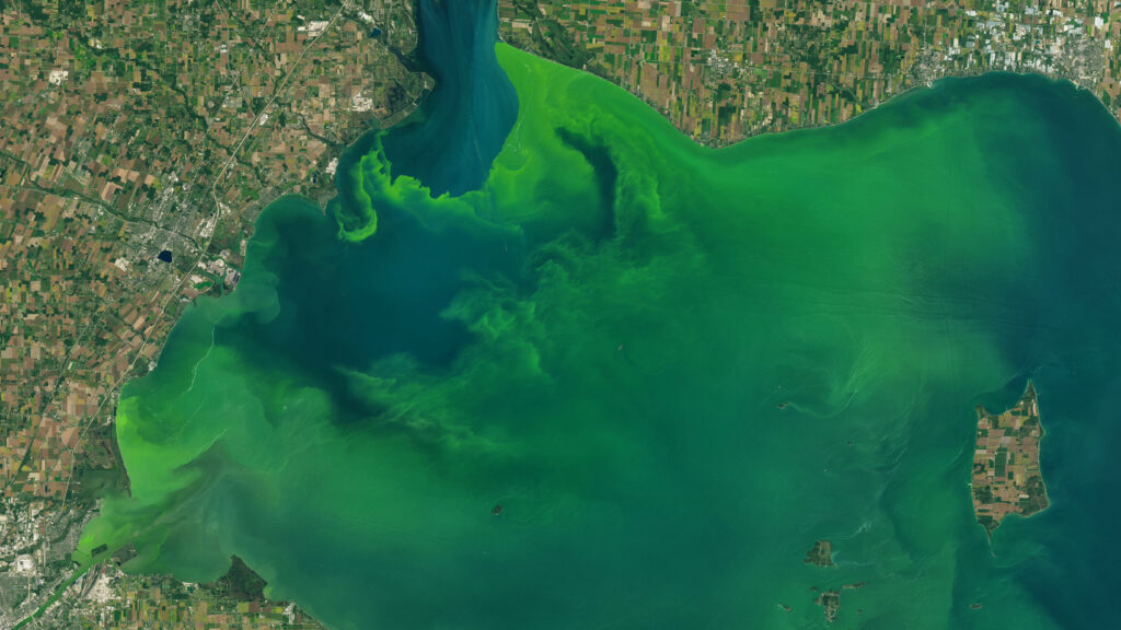
Water vapor, ozone, carbon dioxide and other atmospheric constituents absorb sunlight in particular wavelengths. Most famously, ozone absorbs ultraviolet energy protecting us from those sun rays. Energy absorbed by these gases cannot be reflected back to a satellite, but between these absorption features (where atmospheric attenuation is lessened) energy does reach satellites. These atmospheric “windows” are particularly useful for land imaging and are where you’ll find most land imager spectral bands.
We added the atmospheric transmission curve to our graphic in deference to tradition and to visually communicate that Landsat 8’s new Cirrus Band (1380 nm)—added to detect high, thin cirrus clouds—was purposefully placed outside of an atmospheric window in a region where water vapor absorption limits energy transmission.
The atmospheric transmission curve was never intended to be used as a reference, but since these graphics have become so ubiquitous, we want to provide information on its provenance and provide users with its source data.
The atmospheric transmission data we used was output from MODTRAN (version 4), for a summertime mid-latitude hazy atmosphere (circa 5 km visibility). This setting takes into account absorption caused by atmospheric components as well as Rayleigh and aerosol scattering—thus the lower transmission in the visible region, especially in the blue wavelengths.
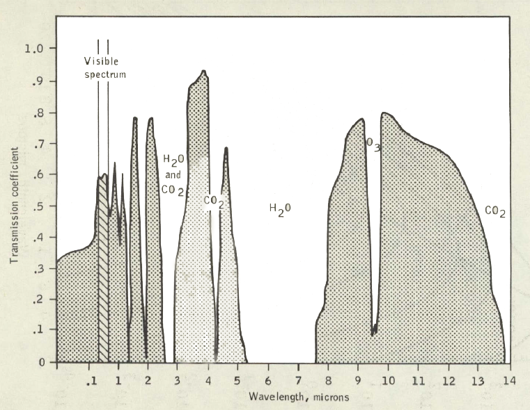
Landsat 7 Science Team member and Rochester Institute of Technology professor John Schott had used MODTRAN4 to generate a plot showing the contributing absorption spectra of individual atmospheric gases and their combined transmission impacts for a figure in his 1997 book Remote Sensing: The Image Chain Approach.
The Landsat calibration team adopted Schott’s MODTRAN4 output for use when showing Landsat satellite band passes on successive satellites. And so it was, that when our outreach team asked our calibration team for atmospheric transmission data, this is the data set that was shared.
The keen observer will notice that the VNIR and SWIR portion of the transmission curve looks smoother than the TIR portion of the curve. This is because for the initial graphic, prior to the addition of the TIRS instrument to LDCM, the cal team used a 9nm traveling average to smooth the 1nm data. This provided a more stylized (and less noisy) background data set for the outreach team. When we later added the thermal infrared portion of the graphic, we skipped the averaging step and just used the 1nm data (some limited smoothing did occur during the raster-to-vector hand-digitization in Adobe InDesign), so the transmission curve shown in the graphic is not entirely consistent.
Here, we are providing that original 1nm MODTRAN4 output as a reference for the community. Please note that this is a modification of a model standard used only to illustrate broad absorption features. It is not—and never was—intended to be used as a standard.
Have fun!
+ Atmospheric transmission data used for Landsat spectral band graphic